A balanced typography pairing, vibrant colors
and iconography bring this project to life
UX/UI / Illustration
A balanced typography pairing, vibrant colors and iconography bring this project to life
UX/UI / Illustration
A balanced typography pairing, vibrant colors
and iconography bring this project to life
UX/UI / Illustration
UI Style Guide
Alicante Let's Play!
UI Style Guide
Alicante Let's Play!
UI Style Guide
Alicante Let's Play!
Initial ideation
Initial ideation
For Alicante Let’s Play! visual identity, I leveraged my expertise in creating cohesive illustrations for children's books.
This experience deepened my understanding of the importance of developing a consistent visual system, ensuring that the brand resonates with parents seeking the best playgrounds for their children.
By applying these principles, I created a visual identity that is both engaging and informative, making it easier for parents to find and explore playgrounds.
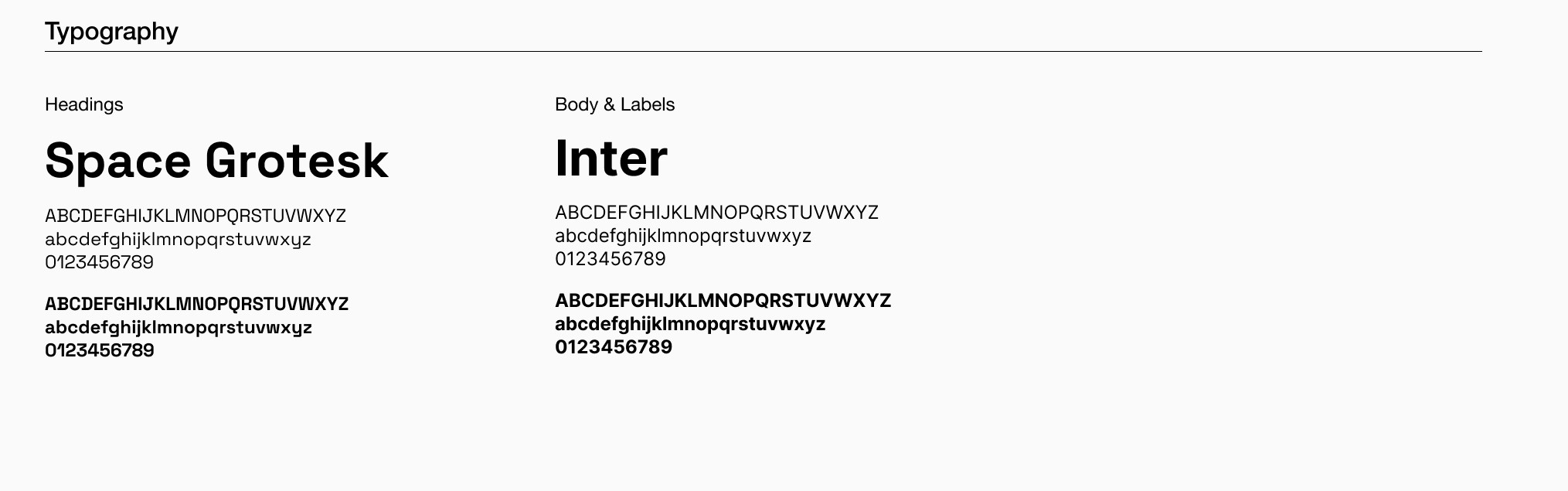
Font Pairing: Space Grotesk and Inter
Font Pairing: Space Grotesk and Inter
Font Pairing: Space Grotesk and Inter
Space Grotesk: Used primarily for headings and titles, Space Grotesk offers a modern, geometric sans-serif style. Its clean lines and distinctive character shapes provide a bold and clear visual hierarchy, making it ideal for drawing attention to key sections of the UI.
Inter: Employed for body text and smaller elements, Inter is a highly legible sans-serif font designed for optimal readability on screens. Its simple and neutral design ensures that longer text blocks are easy to read, providing a comfortable user experience.
The combination of Space Grotesk and Inter creates a balanced and harmonious typographic system. Space Grotesk's strong presence for headlines complements Inter's readability for body text. Together, they enhance the overall clarity and aesthetic appeal of the UI, ensuring that information is presented in an engaging and accessible manner.

Colors: Blending Mondrian with Alicante's Surroundings
Colors: Blending Mondrian with Alicante's Surroundings
Colors: Blending Mondrian with Alicante's Surroundings
For the Alicante Let's Play web app, the chosen color palette is inspired by a mix of artistic, natural, and playful elements to create a vibrant and engaging user experience.
Mondrian Colors and Primary Colors
The use of primary colors is inspired by Piet Mondrian's iconic compositions, which are characterized by bold blocks of primary colors (red, blue, yellow) combined with black and white. These colors are not only fundamental in art but also resonate strongly with children, making the design instantly engaging and relatable to young users.
Alicante's Beach and Sea Colors
The colors of Alicante’s beach and sea bring in a natural and serene vibe. The blue represents the Mediterranean Sea, while the sandy yellow echoes the beautiful beaches. Incorporating these colors helps in creating a connection to the local environment, enhancing the sense of place and cultural relevance for users familiar with Alicante.
Black and Off-White
Black and off-white serve as neutral colors that balance and complement the vibrant primary colors and the beachy tones. These neutral colors provide a clean and modern backdrop, ensuring that the brighter colors stand out without overwhelming the user. They also add to the readability and accessibility of the UI.
The result is a UI design that is vibrant, engaging, and culturally connected, making the Alicante Let's Play web app visually appealing and intuitive for its users.

Illustrations
Illustrations
Illustrations
The illustrations for Alicante Let's Play came from reworking my initial ideas. A sketch with simple, doodled characters inspired a complete redesign and became the project's iconography.
This added life to the project, and with the bright, strong colors, made the design feel like a children's board book with clear text and plenty of white space.
This combination engages both parents and children, highlighting playfulness, fun colors, and good use of white space.
Made with ♥ by Marina Aizen ©2024
Made with ♥ by Marina Aizen ©2024