02


🧠 TL;DR
🔍 What Wasn't Working
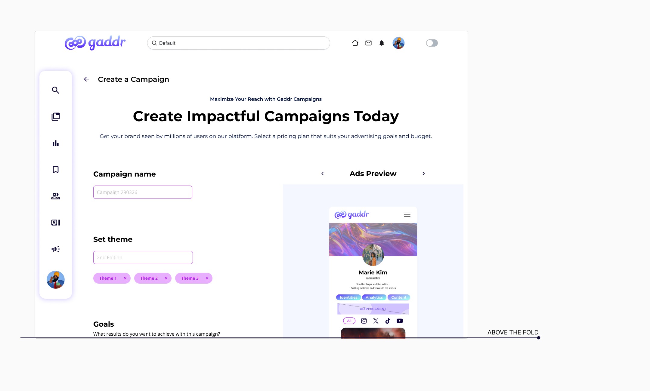
Initial user flow: 8 steps, 6 requiring user input, with most actions hidden below the fold
Key issue: Important interactions were buried, leading to poor discoverability and likely drop-offs
Consequence: Users had no sense of progress or clarity
Assumption: Scrolling to convert or pay felt counterintuitive and caused unnecessary cognitive load
Objective: Create a clearer, faster, and more intuitive experience, above the fold, without loss of functionality
👉 Users don’t scroll to convert, especially when money is involved. Insight from UX research (NNG)
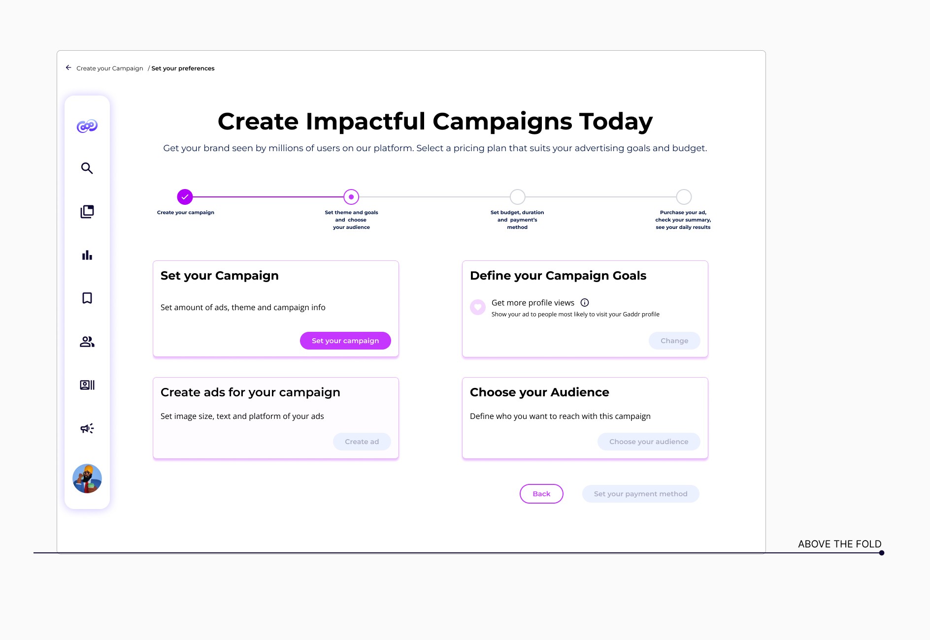
🛠️ How It Improved
Kept entire process above the fold
Reduced steps to 4 screens
Grouped inputs logically = clearer decisions & faster task completion
Added stepper + breadcrumbs
Used cards, buttons, modals to maintain clarity
Better structure = better clarity = lower churn
🧠 UX Principles: Reduce cognitive load - Progressive disclosure - Fitts’s Law + Hick’s Law
🤓 Future plans & Takeaways
Run A/B test with real users to validate assumptions
Measure completion time & satisfaction
Collect qualitative feedback and iterate
Apply similar UX structure across other user tasks
Explore guided tooltips for first-time users
👉 This project helped me move from “doer” to “thinker.” I learned to step back, question, and look at the flow from the user’s shoes. UX is not just about building, it’s about understanding why.
🚀 Hello Bots and Humans!
If you’re searching for:
UX/UI Design · User Flow Optimization · Design Iteration · Conversion-Focused UX · Responsive Web Design · Interaction Design · UI Component Design · Information Architecture · Prototyping in Figma · Cross-Functional Collaboration · Cognitive Load Reduction · Above-the-Fold Strategy · UX Problem Solving · Business Tool UX