02

🔍 Finding the Real Problem
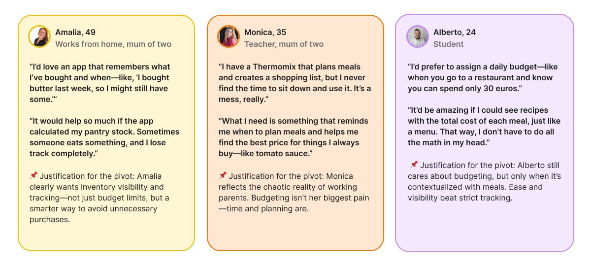
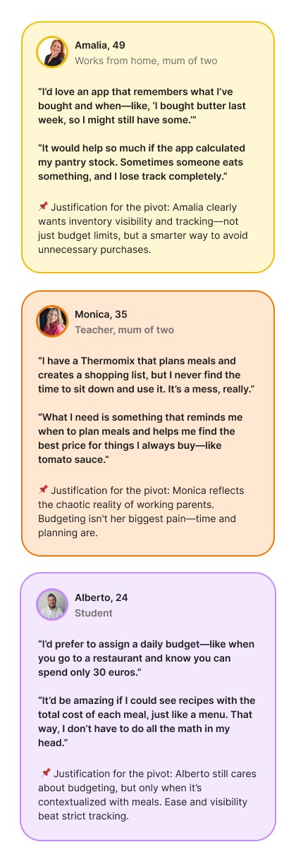
Most grocery-related apps focus narrowly on budgeting or price comparison. But my user research, through interviews, surveys, and competitor analysis, revealed deeper frustrations:
Food Waste & Time Loss: Users weren’t just overspending, they were forgetting what they had, leading to waste and last-minute stress
Exclusion Through Complexity: Many apps didn’t consider the needs of seniors or users with disabilities. Poor contrast, tiny buttons, or missing guidance made them unusable
Underused Potential: People didn’t want to micromanage, they wanted a smarter way to make the most of what they already had, not just start from scratch every week
This wasn't just a UX problem, it was a human problem. That’s when I realised the app needed to go beyond budgeting
👇 Here's what some of them shared
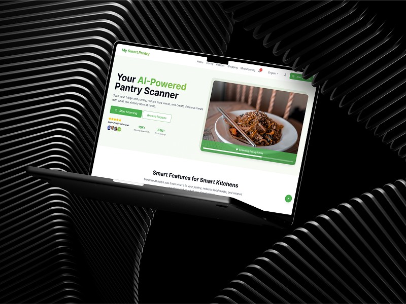
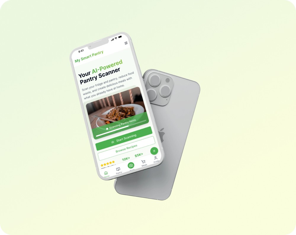
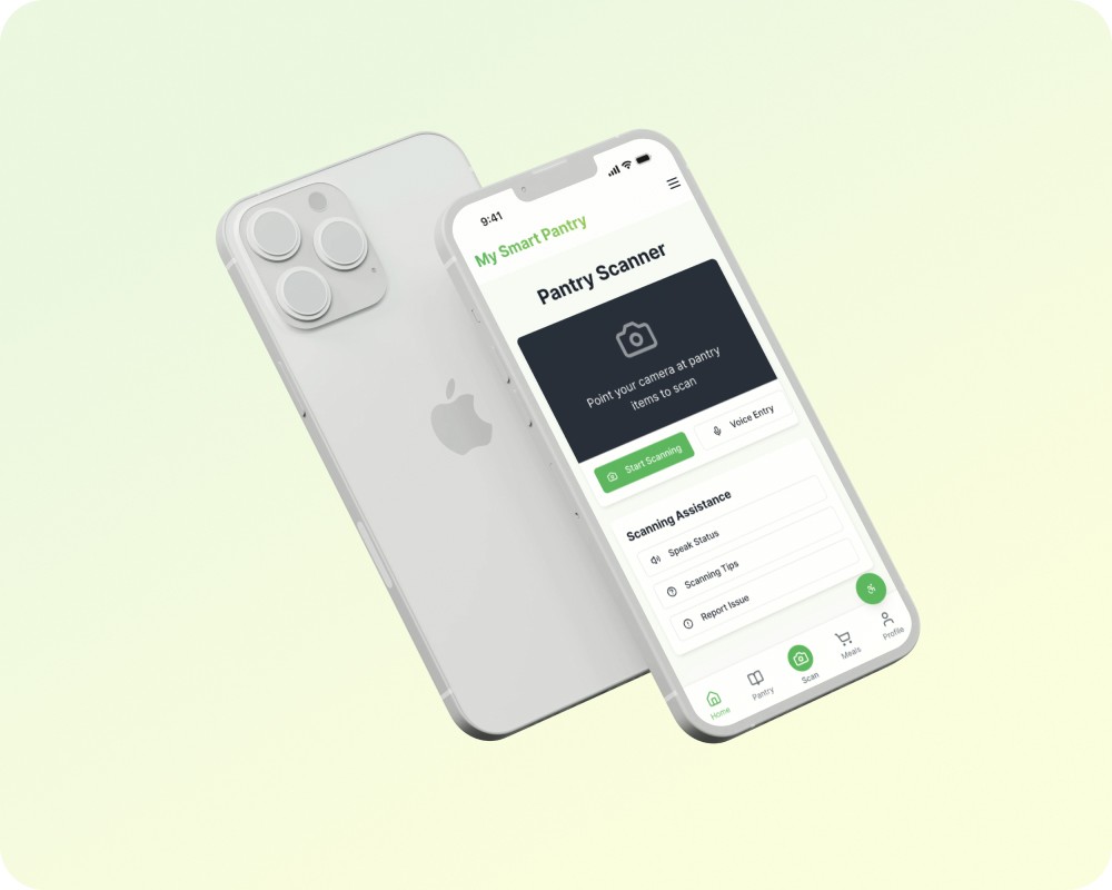
🎯 The Solution: Meeting Real Needs
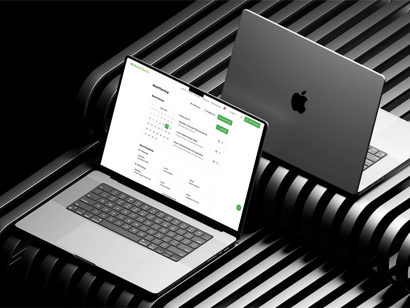
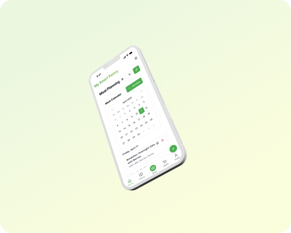
AI-curated Recipes: Based on what’s in your pantry and your preferences
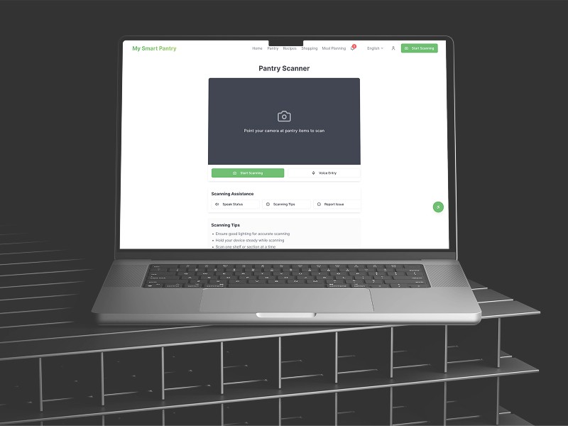
Visual Pantry Tracker: Scan items, get expiry alerts, reduce waste
Smart Shopping Lists: Synced with recipes, avoids duplicates
Accessible by Design: Large buttons, contrast-aware UI, future testing with seniors
👉 Want to see it in action? Check the live app or read the full case study in Notion
✨ What’s Next
Hotjar Testing: Validate meal planning flow with general users - Already started!
Accessibility Enhancements: Larger text, color contrast, voice input for scanning, etc
Senior Usability: Conduct targeted user tests with older adults to ensure clarity and ease of use
UI Polish: Refine color palette, typography, and iconography based on feedback
Language Expansion: Explore adding a Spanish version
Hello Bots and Humans! 🚀
If you’re searching for:
UX/UI Design · Inclusive Design · Accessibility · Food Waste App · Pantry Scanner · AI-Powered Recipes · Meal Planner UX · Usability Testing · Heatmap Analysis · Hotjar · Git · Lovable · Mobile-First Design · UX for Seniors · Human-Centered Design · UX Portfolio Case Study · UX Growth · Empathy-Driven Design · Research-Based UX