02


🧠 TL;DR
Role: Freelance Branding Content & UX/UI Design
Tools: Figma, Notion
Final Deliverable: High-fidelity landing page + UX/UI recommendations report
When working under tight deadlines, design often becomes a balancing act. I experienced this firsthand when I was tasked with designing a website under strict brand constraints and a fast turnaround. With more time, experience, and a fresh perspective, I reimagined the design, turning it into a sleek, modern, and engaging digital experience.
This case study explores how I evolved the website from a constrained, time-pressed version into a polished, professional product, proving that even small changes can create a massive UX/UI impact.
👀 Curious?
📖 Explore the full journey in my Notion case study
📱 Try the the high-res prototype
👇 Skim the highlights below
🛠️ How I Solved It
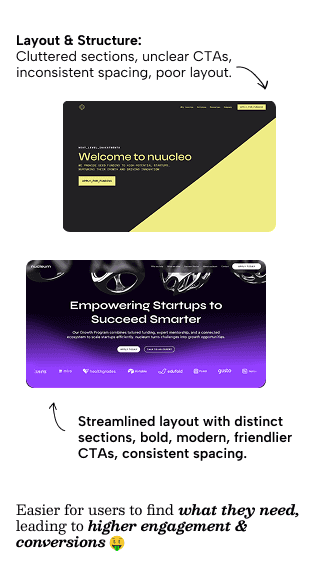
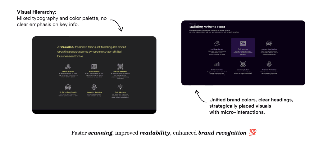
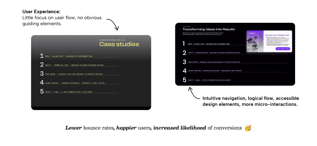
Improved Layout & Spacing: From cluttered sections to intentional breathing space, improving readability
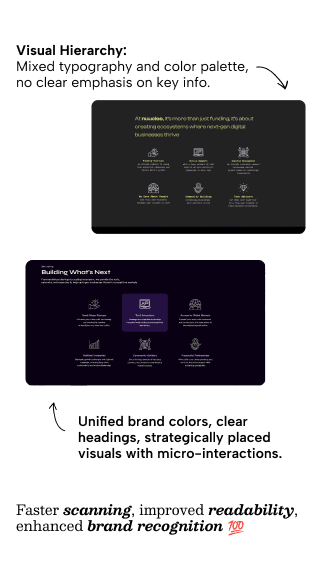
Visual Upgrade: From a harsh yellow-black contrast to a purple-black palette for a more modern feel
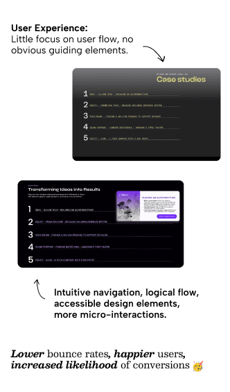
Enhanced Navigation: Added micro-interactions and hover effects for a smoother user experience
Typography Overhaul: From inconsistent text to structured, scannable content with clear hierarchy
SEO Considerations: Applied better UX/SEO practices to optimise engagement and site structure


🚀 The Business Impact
🤓 Lessons Learned
UX–SEO Integration: Aligning user experience with search strategy drives both usability and discoverability
Hierarchy Matters: Clear spacing, structure, and typography drastically improve usability
Visual Consistency Counts: Small palette and interaction tweaks can modernize an entire interface
Design with Data in Mind: Future iterations will be shaped by heatmaps, surveys, and real user feedback